Basics of Print Colour
Understanding the fundamentals of print colour is essential for achieving accurate and vibrant results in any printing project. At its core, print colour refers to the process of reproducing colours onto physical media through various printing techniques. Unlike digital screens that use light to display colours, print mediums rely on inks, dyes, or toners that mix and layer to produce the desired hues.
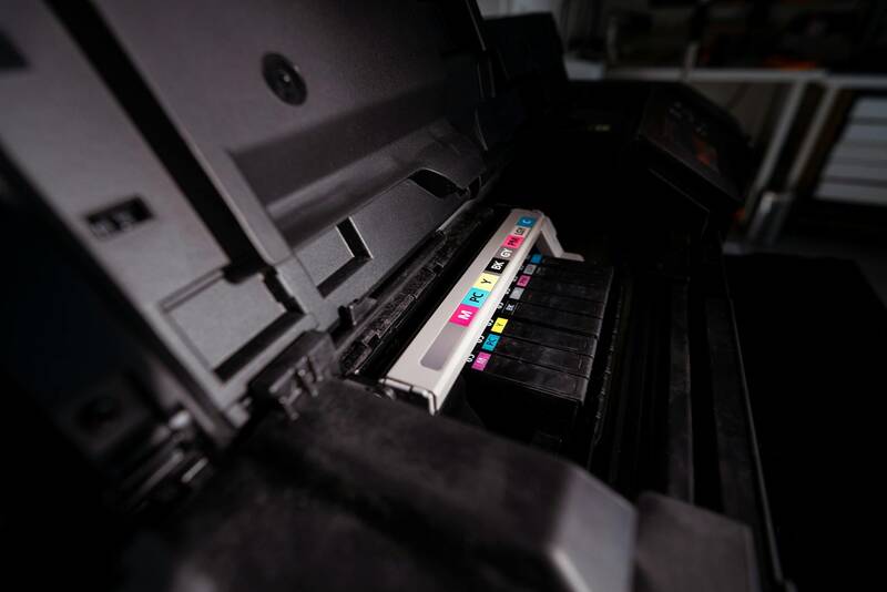
The creation and representation of colours in printing are governed by specific principles that ensure consistency and precision. Primary colours in printing typically include Cyan, Magenta, Yellow, and Key (black), collectively known as CMYK. These colourants are combined in different proportions to produce a broad spectrum of colours, allowing printers to render complex images and designs with high fidelity.
When preparing digital files for print, colour profiles and standards are used to communicate how colours should be interpreted and reproduced. This process involves converting digital colours to physical inks, which can sometimes lead to variations due to differences in materials, equipment, and environmental factors.

Achieving the desired print colour requires an understanding of how inks interact on various substrates like paper, fabric, or plastic. The absorption properties, surface texture, and even ambient light can influence the final appearance of printed colours. As such, precise control over ink formulation, printing conditions, and material quality is vital for producing consistent, high-quality results.
In sum, mastering the basics of print colour involves knowledge of colour creation, representation, and the factors that affect colour fidelity across different printing processes and materials. This foundational understanding is crucial for professionals aiming to deliver accurate, vibrant, and professional printing outcomes.
Understanding Colour Models Used in Printing
In the realm of professional printing, selecting the appropriate colour model is fundamental to achieving precise and consistent results. The two dominant colour models employed are CMYK and RGB, each serving distinct purposes within their respective domains.
CMYK Colour Model
The CMYK (Cyan, Magenta, Yellow, Key/Black) model is the standard in commercial printing. It is a subtractive colour model, meaning colours are created by subtracting light from white surfaces through the layering of inks. When combining cyan, magenta, and yellow inks in various proportions, a broad spectrum of colours can be produced. The inclusion of black, or Key, enhances depth and contrast while reducing ink usage for darker shades.
CMYK colour profiles are carefully calibrated to ensure colour consistency across different print runs and materials. This calibration is crucial because variations in paper absorption, ink formulation, and printing press settings can affect the final colour output. Professionals typically utilize colour management systems linked with specific output profiles to maintain reproducibility and accuracy in printed materials.

RGB Colour Model
The RGB (Red, Green, Blue) model is primarily used in digital displays, such as screens and monitors. It is an additive colour model, meaning colours are generated by combining varying intensities of red, green, and blue light. While RGB is suitable for designing visual elements intended for digital viewing, it does not translate directly into print, where subtractive colour mixing prevails.
Designers often create initial concepts in RGB due to its expansive colour range. However, before printing, these digital designs are converted into CMYK to ensure colour accuracy on physical media. This conversion involves colour profile adjustments to match the colour gamut and display capabilities of the final printed product.
Differences and Complementary Uses
- Scope: RGB covers a wider colour gamut, making it ideal for digital content. CMYK is optimized for physical printing and colour consistency across different substrates.
- Application: RGB is used during the initial design phase. CMYK is applied in the final stages of production to produce printed materials.
- Conversion: Converting RGB to CMYK requires careful adjustment to prevent colour shifts and loss of vibrancy.
Understanding the characteristics and appropriate applications of these models ensures high fidelity in colour reproduction, whether preparing digital artwork or producing physical prints. This knowledge forms the basis for colour management and calibration processes, which are vital for professional-quality output.
Color Matching and Calibration
Achieving precise print colours hinges critically on meticulous colour matching and calibration practices. Colour calibration involves adjusting and standardising the output of printers, monitors, and other devices to ensure consistent colour reproduction across various media and processes. This process is fundamental for maintaining brand integrity, meeting client expectations, and delivering professional-quality results.
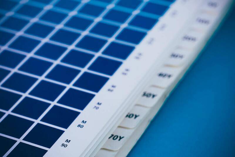
One of the most widely adopted approaches is the use of industry-standard colour profiles, such as ICC (International Color Consortium) profiles. These profiles serve as digital maps, translating colours from digital files to physical outputs, aligning the colour spaces of design software and printing hardware. Incorporating ICC profiles during prepress workflows helps minimize unexpected colour shifts, ensuring that the final print closely matches the original design intent.
Regular calibration of devices is essential in this process. For printers, calibration involves adjusting ink density and colour output to match standard reference values. This process often utilises calibration tools and test charts, which are printed and then measured using spectrophotometers or colourimeters. These instruments provide objective data to fine-tune the printer's settings, ensuring colour consistency over time.

Monitors, which serve as the digital workspace for designers, must also be calibrated regularly to ensure the colours seen on screen accurately reflect the printed output. Hardware calibration devices, such as colourimeters, are used to measure the screen's output, and software adjustments align the display’s colour profile to industry standards.
Another key aspect is maintaining consistent colour management throughout the entire production workflow. This includes standardising file formats, colour spaces, and output settings. Implementing robust colour management protocols reduces the risk of colour inconsistencies that can arise from different devices, substrates, or environmental conditions.
Proper calibration also involves considering ambient lighting conditions during both digital viewing and physical printing. Controlled lighting environments help ensure that colour assessments are accurate, minimizing the influence of external light sources that can alter perception.
Beyond technical adjustments, ongoing training and standard operating procedures are vital. Operators should be well-versed in colour management principles and routinely perform calibration routines to uphold quality standards. This disciplined approach ensures that each print run maintains colour fidelity, reinforcing the reliability and professionalism of print services.

In summary, consistent colour matching and calibration are cornerstones of high-quality printing. By leveraging advanced tools, standardized profiles, and disciplined workflows, print providers can deliver outputs that meet precise colour specifications, ultimately enhancing client satisfaction and brand consistency.
Understanding the Impact of Substrate and Printing Techniques on Colour Fidelity
Selection of the right substrate plays a pivotal role in achieving accurate and vibrant print colours. Different materials—be it paper, vinyl, canvas, or fabric—possess unique absorption and reflectance properties that influence how colours manifest in the final product. Glossy surfaces tend to enhance colour saturation and provide a vivid appearance, making colours appear brighter and more intense. Conversely, matte finishes diffuse light, which can soften colours and reduce glare, offering a more subdued yet sophisticated aesthetic. Therefore, choosing the appropriate substrate based on the desired visual outcome and material compatibility is essential for colour consistency.
In addition to substrate considerations, the type of printing technique employed significantly impacts colour quality. Offset printing, for instance, provides high precision and colour accuracy through meticulous ink modulation, making it ideal for large-volume projects demanding consistent colours. Digital printing, on the other hand, offers rapid turnaround times and flexibility, especially suitable for small runs and personalized prints. However, it may require more frequent calibration to ensure colours remain true across different jobs.
Advanced printing methods like UV printing or solvent-based inks also introduce unique considerations for colour reproduction. UV printing, known for its durability and vibrant output on a variety of surfaces, demands compatibility of inks and substrates to prevent colour shifts. Solvent-based inks are advantageous for outdoor applications but require precise calibration to maintain accurate colour rendition under different environmental conditions.
Calibrating Equipment and Using Industry-Standard Colour Profiles
To achieve consistent and precise colours, employing high-quality calibration tools is fundamental. Devices such as spectrophotometers and densitometers enable accurate measurement of colour output, guiding adjustments in printer settings and ink formulations. Regular calibration routines ensure that the colour output aligns with industry benchmarks, reducing variability over time.
Utilizing industry-standard colour profiles—like ISO Coated v2 or Fogra19—facilitates predictable colour reproduction across different devices and substrates. Incorporating these profiles into design files and print workflows enhances cross-device consistency, ensuring that colours look identical whether viewed digitally or on printed materials.

Implementing meticulous colour management protocols across the entire production process reduces discrepancies and maintains brand integrity. This includes integrating colour profiles into digital files, configuring printers to match these profiles, and performing regular checks to adjust for environmental factors and equipment wear.
Environmental and Operational Factors Affecting Colour Output
The surrounding environment and operational practices also influence print colour quality. Ambient lighting conditions, humidity, and temperature can alter ink behaviour and colour perception during production. Printing in a controlled environment with stable conditions minimizes colour drift and ensures repeatability.
Operator expertise is equally vital. Skilled professionals with in-depth understanding of colour management can troubleshoot issues related to ink density, paper handling, and weather conditions, thus preserving colour accuracy. Routine training and strict adherence to standard operating procedures enhance the overall quality and reliability of print colour outcomes.
Implementing Effective Color Matching and Calibration Techniques
Achieving precise color accuracy across various print jobs requires a systematic approach to color matching and calibration. Utilizing professional calibration tools such as spectrophotometers allows print providers to measure and compare printed colors against a standard reference. These devices capture the nuances of color output, providing data that can be used to fine-tune printers for optimal performance.
Regular calibration routines are essential to maintain consistency. This involves updating printer settings, color profiles, and maintaining the health of print equipment. For instance, calibration should be performed after significant usage, when switching between different ink types or substrates, or following environmental changes that could influence ink behavior.
Employing industry-standard color management workflows—such as integrating ICC profiles into digital files—ensures that digital design intent corresponds with the final printed result. Properly embedded profiles guide printers to produce colors that match the original design, safeguarding brand consistency and reducing costly reprints.
The Role of Standardized Colour Profiles in Printing
Color profiles serve as the foundation for predictable color reproduction. Profiles like ISO Coated v2 or Fogra39 provide predefined parameters for specific paper types and printing conditions. Incorporating these profiles into the prepress process ensures that colors are interpreted correctly by the printer, regardless of the equipment or substrate used.
Manufacturers often deliver color profiles tailored to their inks and papers, enabling printers to create a consistent color environment across multiple jobs and locations. When design files are prepared with these profiles embedded, it simplifies the workflow and dramatically improves the accuracy of color output from digital to print.

Maintaining Colour Consistency with Repeated Printing
Consistency in print colour over multiple runs is achieved through rigorous control measures. These include the regular calibration of printing devices, strict adherence to ink and paper specifications, and maintaining a consistent environment within the printing area. Monitoring tools and software can track deviations and alert operators to discrepancies before they affect the final product.
Furthermore, establishing a standard operating procedure (SOP) for each print job helps streamline processes and minimizes variability. Consistent ink batches, proper storage of materials, and calibration logs are also crucial components. As a result, ongoing quality control ensures that each batch aligns closely with the original design intent, preserving brand standards and client satisfaction.
Incorporating Quality Control Checks During Production
Implementing pre- and post-print quality checks forms a vital component of color management. During the pre-press stage, proofs are compared against digital files and identified color targets using calibrated monitors and spectrophotometers. During production, random sampling and measurement of printed sheets can detect colour deviations early, allowing for immediate adjustments.
This proactive approach reduces waste and rework, ensuring clients receive flawless, accurately colored materials. Periodic training for operators on the latest color management techniques further enhances overall output quality and equips staff to troubleshoot effectively.
Understanding the Importance of Colour Matching and Calibration in Printing
Colour matching and calibration are fundamental processes in achieving consistent and vibrant colours across all printed materials. These procedures ensure that the colours produced align precisely with the original design specifications and client expectations. Variability in print colour can stem from numerous factors such as differences in ink batches, paper types, and printing equipment, making calibration a vital step in the workflow.
To establish accurate colour reproduction, printers utilize calibration tools like spectrophotometers and colour management software. These tools measure the output of printed samples and compare them with precise colour standards. Adjustments are then made to the printer's settings to align the output accordingly. Regular calibration routines are necessary because printer components, such as inkjet nozzles or toner drums, can drift from their optimal settings over time, affecting colour fidelity.
Consistency in print colour is also maintained through the creation and use of colour profiles. These profiles serve as reference points that translate digital colour data into specific printer output conditions. Implementing standard colour profiles tailored for different media ensures that colours stay true regardless of the material or printing method used.
Furthermore, calibration extends beyond equipment to include environmental factors. Controlling ambient light, temperature, and humidity within the printing environment helps preserve colour consistency. Standardising these conditions reduces the risk of colour shift during production, ensuring each print run maintains the desired visual quality.
Implementing Effective Colour Management Systems
Modern colour management systems (CMS) integrate hardware and software to automate calibration and maintain colour consistency. These systems utilize colour profiles, monitor conditions, and provide real-time feedback to operators. They streamline workflows by minimizing manual adjustments and ensuring that all components operate within optimal parameters.
Maintaining detailed calibration logs and performing periodic audits of equipment and media are essential practices for supporting long-term colour stability. Clear documentation of calibration procedures helps identify trends, troubleshoot issues promptly, and uphold high standards across production batches.
Through a combination of precise calibration, vigilant environmental control, and advanced management systems, print providers can deliver colours that consistently meet or exceed expectations. This meticulous approach not only enhances visual appeal but also fortifies brand integrity by ensuring colour accuracy across diverse printed applications.
Understanding Color Matching and Calibration
Color matching is a critical aspect of achieving precise print colours that accurately reflect the intended design. It involves aligning the colours in digital files with the output produced by the printer, which requires meticulous calibration of the printing equipment. Calibration ensures that the printer's output aligns with colour standards, minimizing discrepancies caused by hardware variations or media differences.
To maintain optimal colour accuracy, regular calibration routines should be integrated into the printing process. These routines typically include printing test charts, measuring colour output with spectrophotometers, and adjusting printer settings accordingly. Calibration should also account for variations in ink batches, substrate types, and environmental conditions that can influence colour reproduction.
Implementing Color Management Systems in Printing
Color management systems (CMS) are sophisticated tools designed to streamline the complex process of maintaining consistent print colours. These systems utilize colour profiles—such as ICC profiles—to translate digital colour data into output signals that the printer can accurately interpret. A comprehensive CMS monitors and adjusts colour parameters in real-time, ensuring the printed colours closely match the digital design.
Setting up an effective CMS involves several key steps:
- Creating or obtaining precise colour profiles for different media types.
- Regular calibration of devices involved, including monitors, printers, and scanners.
- Implementing workflow protocols that integrate colour data management seamlessly.
- Performing periodic audits to verify accuracy and consistency over time.
Optimizing Environmental Conditions for Colour Stability
External environmental factors significantly impact colour fidelity during printing. Fluctuations in ambient light, temperature, and humidity can cause ink spreading, drying inconsistencies, and colour shifts. Controlling these variables through dedicated climate-controlled rooms or enclosures helps preserve colour integrity.
Standardizing lighting conditions with neutral, daylight-balanced lighting ensures accurate colour assessment during proofing and quality checks. Consistent environmental controls lessen the risk of variation from one batch to another, enabling more predictable colour outcomes across production runs.

Final Considerations on Print Colour Accuracy and Selection
Achieving optimal print colour fidelity is a nuanced process that relies heavily on the careful selection of ink types, substrates, and printing techniques. For businesses and designers aiming for consistent and vibrant results, understanding the interplay between ink behaviour and material properties is essential. High-quality inks formulated with precise pigment dispersion not only enhance colour vibrancy but also improve resistance to fading and environmental factors. Selecting the appropriate substrate, whether it's matte, gloss, or specialized textured papers, impacts how light interacts with the printed surface, influencing perceived colour depth and accuracy.

Inkjet, offset, digital, and flexographic printing each have unique considerations regarding colour fidelity. For instance, inkjet printing offers remarkable colour control and versatility, making it ideal for short runs and personalized prints. Offset printing, on the other hand, provides superior color consistency across large volumes, provided that meticulous colour management protocols are followed. It's important to consult with print specialists to determine the most suitable combination of technology, ink formulation, and substrate for your specific project requirements.
Implementing Quality Control Measures
To maintain colour accuracy throughout production, integrating rigorous quality control measures is crucial. This involves regular visual inspections, employing calibrated colour measurement instruments, and adhering to pre-set colour standards. Using spectrophotometers and colour densitometers allows precise quantification of ink coverage and hue, facilitating adjustments before large-scale printing begins. Establishing a detailed colour management protocol—covering everything from pre-press stages and proofing to final printing—reduces the risk of inconsistencies and enhances overall print reliability.
Staff Training and Best Practices
Equipping technical staff with comprehensive training on colour management principles, device calibration, and workflow optimization significantly enhances the quality of printed outputs. Knowledgeable operators can identify potential colour deviations early and adjust parameters accurately. Developing clear standard operating procedures (SOPs) for handling materials, performing calibrations, and conducting quality checks creates a structured environment that consistently produces accurate, vibrant colours and minimizes waste.
Utilizing Digital Proofing for Accurate Colour Prediction
Digital proofing technologies such as soft proofing on calibrated monitors or digital prints enable clients and printers to preview how colours will appear post-production. These preview systems, backed by colour management profiles, ensure that expectations are aligned with tangible results. By integrating proofing into the workflow, discrepancies in colour can be identified and rectified early, saving costs and time while guaranteeing high-quality final prints.
Continual Advancement and Innovation in Print Colour Technologies
Emerging innovations, including digital colour mixing systems, enhanced LED UV curing methods, and innovative pigment formulations, are pushing the boundaries of what is possible in print colour accuracy and vibrancy. These advancements promise more precise reproduction of complex colour gradients and special effects, ultimately expanding creative possibilities for print professionals. Staying updated with the latest technological developments through industry collaborations and vendor partnerships ensures that print providers can meet and exceed evolving client expectations for colour fidelity.