The question behind the quote
Sooner or later a print quote arrives with a line that says "1 spot colour" or "CMYK plus Pantone 286 C", and the price is noticeably higher than the plain CMYK version. Or a designer insists the logo must be printed as a Pantone colour, while the online printer only offers full colour. For a buyer, the question is simple: is the exact colour worth the money on this job? The answer depends on the colour, the quantity, the printing method and how visible a slight colour shift would be. This guide explains the difference in plain terms, where the extra cost comes from, and how to decide job by job.
CMYK and spot colours in plain terms
CMYK (cyan, magenta, yellow and black) is the standard four-colour process. Every colour on the page is built from tiny dots of these four inks. Full-colour photographs, most brochures and nearly all digital printing use CMYK.
A spot colour is a single ink mixed to an exact recipe before printing, then printed as a solid layer. The most widely used system for specifying these inks is the Pantone Matching System, which gives each colour a number (for example "Pantone 485 C"). The letter after the number matters: C is for coated paper, U for uncoated. The same ink looks different on the two, so a brand guide should specify both.
The key practical difference: a spot colour is the same ink every time, while a CMYK colour is a simulation that depends on the press, the paper and the operator. For most colours the simulation is close enough. For some, it is not.
Colours that CMYK struggles to match
The CMYK gamut (the range of colours it can reproduce) is smaller than the Pantone range. Some colours fall well outside it:
- Bright oranges and vivid greens. CMYK versions tend to look duller or slightly brown.
- Strong blues and purples, such as the royal blues many corporate brands use. CMYK often shifts them towards violet or greyish blue.
- Fluorescent colours, which cannot be reproduced in CMYK at all.
- Metallic golds and silvers, which need a metallic ink or foil. CMYK can only imitate them with a flat mustard or grey.
- Large flat areas of a light tint, where CMYK dot patterns and small variations are easy to see.
A useful test: ask your designer or printer to check your brand colour against a Pantone "colour bridge" guide, which shows each spot colour next to its closest CMYK equivalent. If the two swatches look nearly identical, CMYK will serve you well. If they visibly differ, you have a decision to make. Our article on getting print colour right explains why the screen is a poor judge of this.
Where the extra cost comes from
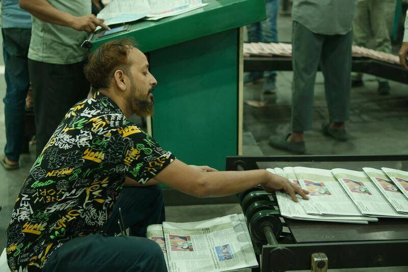
On offset presses, each ink is printed from its own plate on its own press unit. Adding a spot colour to a CMYK job means an extra plate, a fifth unit (or a second pass on a four-colour press), mixing the ink and washing it out after the run. Those are mostly fixed costs, paid once per job whatever the quantity. On a long run they are spread thin; on a short run they dominate the price.
| Situation | Effect of adding a spot colour |
|---|---|
| Long offset run (thousands of copies) | Modest increase per copy; set-up spread across many units |
| Short offset run (a few hundred) | Large increase per copy; the fixed cost is shared by few units |
| Digital print | Usually not possible as a true spot ink; the printer simulates it in CMYK or an extended gamut |
| One or two spot colours only, no CMYK | Can be cheaper than full colour for simple jobs like letterheads and envelopes |
That last line is easy to miss. A letterhead printed in two Pantone colours (say the brand blue and black) uses two plates instead of four, and can cost less than a CMYK version while matching the brand exactly. For stationery printed in large runs, a two-spot design is often the cheapest and the most accurate option at once.
How digital printing changes the picture
Most short-run work in Singapore today, including business cards, small brochure runs and posters, is printed digitally. Standard digital presses print in CMYK toner or ink and cannot load a mixed Pantone ink. Some newer presses add extra colours (orange, green, violet or a fifth "spot" station for white, gold or fluorescent) that widen the range and get closer to hard-to-match brand colours. If your colour is difficult and your quantity is small, ask printers specifically whether they have extended-gamut digital equipment and request a printed sample of your colour on it. Our comparison of digital and offset printing by quantity and budget covers the break-even points in more detail.
A simple decision guide
- Use CMYK when the job is full colour anyway, the brand colour is inside the CMYK gamut, the quantity is small, or the item is short-lived (flyers, event posters).
- Use CMYK plus one spot when the brand colour is outside the gamut, it covers a large area (a cover, a folder, packaging), and the run is long enough to absorb the set-up.
- Use spot colours only for simple designs in large volumes: letterheads, envelopes, compliment slips, forms, carrier bags.
- Use foil instead of metallic ink when you need real shine on a small area, such as a logo on a business card. See our comparison of finishing options.
Keeping colour consistent across suppliers
Companies often buy print from several suppliers: cards from one, banners from another, packaging from a third. Even with spot colours, a banner printed on vinyl will never match a business card exactly, because the material and process are different. What you can control:
- Publish the brand colour as Pantone C, Pantone U, CMYK and RGB values in your brand guide, and send it with every order.
- Keep a printed reference (a good business card or brochure) and ask new suppliers to match to it.
- For important jobs, ask for a hard proof or a press check.
- Accept that some variation between materials is normal, and decide in advance what range is acceptable.
When comparing quotes, make sure every supplier is quoting on the same basis. One quote for "full colour" and another for "CMYK plus Pantone" are not comparable; our guide to comparing print quotes lists what else to line up.
Colour-accurate printing from us
We print in CMYK, spot colours and combinations of both, and we will tell you honestly which one your job needs. Send us your brand guide or a printed reference and we will check your colours against the CMYK gamut, quote the job both ways where it makes sense, and show you the difference on paper before you commit. Short runs go through our digital printing services, with a printed colour sample on request; longer runs of stationery and covers are quoted for offset with spot inks. For a side-by-side quote, send the artwork, quantity and brand colour codes through our contact page.