Not every flaw is a defect
A delivery arrives and something looks off. The colour is not quite the blue on your screen, one edge is a hair narrower than the other, a few sheets near the bottom have a mark. The question is whether you have received a bad job or a normal one.
Print is a mechanical process working with a natural material, and it has published tolerances the same way engineering does. Knowing roughly where they sit lets you reject what should be rejected and accept what is genuinely within range, which saves a great deal of time arguing about the wrong things.
Variation that is normal
Trim position
A guillotine cuts through a lift of many sheets, and the blade deflects very slightly through the stack. Around 1mm of variation in where the trim falls is standard across a run. This is why bleed exists and why nothing important should sit near the edge. A border 2mm wide will look uneven across a job, and that is a design decision rather than a printing fault.
Colour drift within a run
Ink density is monitored and adjusted while a press runs, and it moves within a band. Two copies from opposite ends of a long run can differ slightly on a solid area. On a photographic image nobody will see it. On a large flat corporate colour, some people will.
Colour between runs
A reprint six months later, on a different paper batch, on a different press, will be close rather than identical. If exact matching matters, that has to be specified in advance, usually by working to a Pantone rather than a CMYK build.
Registration
The colour layers land within a small tolerance of each other, not perfectly. Fine reversed-out type in a colour built from several inks is where this shows first, which is a reason to build small text from a single colour.
Quantity
Long runs deliver within a percentage of the ordered quantity rather than exactly, unless a guaranteed minimum was agreed.

What is a genuine defect
- Text or images that do not match the approved proof
- Pages bound out of order, upside down, or missing entirely
- Visible banding, streaking or repeating marks across the sheet
- Ink that offsets onto the back of the sheet above it in the stack
- Cracked folds on a scored piece, or lamination lifting at an edge
- Colour outside the agreed tolerance against a signed proof or a specified Pantone
- Trim that cuts into content that was inside the safe area
- The wrong paper, the wrong weight, or the wrong finish against the order
The common thread is the proof. A signed proof is the contract for what the job should look like, which is why approving one quickly and without reading it is such an expensive habit.
Checking a delivery properly
Check on the day it arrives, before the cartons are distributed. Once boxes go out to four offices, establishing what was wrong becomes impossible.
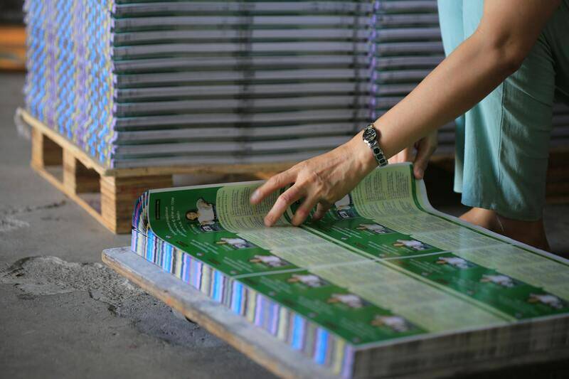
Open cartons from different parts of the pallet rather than the top one, since a fault often affects part of a run. Pull sheets from the top, middle and bottom of a lift. Compare against the approved proof in daylight or under a neutral light, not under warm office lighting, which shifts colour perception enough to start an argument that need not happen.
For bound work, check the page order on several copies, flex the spine, and open one fully to see whether it lies flat as specified. For folded work, check the fold position and look along the crease for cracking.
Photograph anything questionable next to the proof, with the whole sheet in frame rather than a close crop. A tight photograph of a mark proves the mark exists and not where it is or how big it is.
Raising it without losing time
Contact the printer immediately and describe what you are seeing rather than what you conclude. "The blue on the cover is noticeably lighter than the signed proof on about half the copies" gives them something to act on. "The job is wrong" does not.
Keep everything until it is resolved. A printer investigating a fault will want to see the material, and disposing of it removes both the evidence and any possibility of a partial credit. Do not distribute a job you intend to complain about, because using half of it substantially weakens the position.
Be clear about what outcome you need. A reprint takes the original lead time again, which may be useless if the event is Thursday. A credit, a partial reprint of the worst cartons, or a discount may serve better. Saying which one you need turns the conversation into a decision rather than a dispute.
Where a fault is genuine, a reasonable printer reprints or credits without much argument, because the alternative is losing an account over a job. Where the complaint is about normal variation, expect to be shown the tolerance and the proof, and to be right about it only sometimes.
When the fault came from the file
A fair number of problems are not printing errors at all. The job came out exactly as supplied, and what was supplied had something wrong with it. Knowing where that line falls saves an uncomfortable conversation.
If a typo was in the artwork and on the proof, it is yours. If an image was supplied at low resolution and looks soft, it is yours, though a good printer should have flagged it before printing. If a colour was built in RGB and converted to something duller, that is a supply issue, and again one worth flagging rather than printing quietly.
The grey area is a file check. Many printers run a preflight and report obvious problems, and that service creates a reasonable expectation. If a printer's preflight missed a page at 72dpi and printed it anyway without comment, most will share the cost rather than argue, because catching that is what the check is for.
Where you supplied a file that could not produce the result you wanted, the useful move is to ask what would fix it rather than who is at fault. A printer who can point at the exact problem in the file is usually willing to help you get it right on the reprint, and often at a better price than the original.
Keep the approved proof and the supplied file together in your records. Six months on, neither side remembers what was sent, and the two files settle it in a minute.
Preventing most of this at the order stage
Nearly every dispute traces back to an expectation that was never written down. A few habits remove most of them.
Approve a hard copy proof rather than a screen PDF for anything where colour matters. Screens are backlit and paper is not, and the difference is covered in getting print colour right. Specify a Pantone for a brand colour instead of hoping a CMYK build lands. State a guaranteed minimum quantity if the number is fixed. Keep critical content well inside the trim. And ask what the tolerance is on anything you know you will be fussy about, before the job runs rather than after.
We work to a signed proof and we will tell you when a specification is likely to produce a result you will not be happy with. If a delivery ever looks wrong, tell us the same day and keep the cartons closed. Sorting it out is straightforward while the job is still intact and the press records are current.
For choosing a supplier who handles this well in the first place, checking out a printer before you order covers the questions worth asking, and the digital printing services page lists what we run and the proofing available on each.